The Tennis Trophy as a Designed Object
See how a tennis trophy’s shape, materials, and display turn a sporting award into a lasting visual emblem, and learn what details to notice.
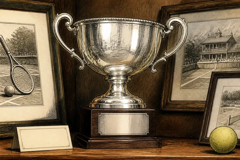
A tennis trophy can make a match visible long after the last point: a silver bowl catches a room’s light, while its handles suggest a gesture of offering or celebration. Looking closely at a tennis trophy as a designed object reveals how shape, material, and display turn an award into an emblem that spectators can recognize and remember.
What does a trophy communicate before anyone reads its name?
Start with silhouette. A cup, bowl, column, or abstract sculpture carries a different visual mood before lettering or engraving enters the picture. A broad rim gives a trophy an open, public presence; a narrow stem lifts the award above its base and makes the upper form seem almost weightless. A compact object can feel more intimate, especially when its details invite close viewing.
Handles are especially expressive. They make an object easier to lift, but they also frame the central form and offer a recognizable outline from across a room. Curving handles may suggest movement; squared ones can make the same vessel appear architectural. Neither shape tells a complete story on its own. Their effect depends on scale, finish, and the object surrounding them.
Lettering also belongs to the design, not just the record. A name cut into a base feels different from one engraved around a rim or printed on a separate plaque. The placement affects what a viewer notices first: the trophy’s shape, its association with an event, or the names of those who received it.
How do materials shape the object’s character?
Metal reflects its surroundings, so polished silver or brass can make a trophy appear lively under changing light. A satin finish softens reflections and brings attention to the outline rather than bright highlights. Gold-colored surfaces read as ceremonial to many viewers, while darkened metal can make engraved details stand out. These impressions come from finish and context as much as from the material itself.
Wood, stone, glass, and resin can appear in a trophy’s base or sculptural elements. A dark wooden base often sets off bright metal and provides a visual anchor. Stone gives an impression of weight, while glass can make an object seem delicate and open. A clear or colored resin component may allow unusual shapes, but it can also compete with lettering if too many visual effects are combined.
Materials change how a trophy meets its setting. A reflective cup placed beside a matte wall produces a different effect from the same cup under a glass case with spotlights. Dust, fingerprints, and glare may distract from a carefully made surface, so display conditions are part of the object’s presentation, not an afterthought.
How should a trophy be displayed so its design remains legible?
Begin with the viewing distance. If visitors will see the trophy from across a clubhouse room, its silhouette and broad proportions should remain clear. Fine engraving matters more when people can approach the display. A case can protect an award, but reflections on its glass may obscure the object; a small shift in lighting or viewing angle can help reduce that distraction.
Give the trophy visual space. Nearby plaques, photographs, and other awards can provide context, but a crowded shelf makes each object harder to read. Aligning a trophy with its own inscription helps connect form and identity. If the award has a broad bowl or tall handles, leave enough open area around that outline rather than pushing it against neighboring objects.
Imagine a club placing a silver-colored cup on a deep wooden shelf beside several framed photographs. The staff moves one frame to the side, adds a simple label beneath the cup, and adjusts the display light so it does not bounce directly into the case. Visitors can then see the trophy’s outline first and read its event name without mistaking it for a generic decoration.
It is not worth the effort to add elaborate props or dramatic lighting simply to make a trophy look more important. Too many decorative elements compete with the award’s own design and can make a small display feel theatrical rather than clear.
What should you look for when comparing tennis trophies?
Why do some trophies have broad bowls?
A broad bowl creates a generous, easily recognized silhouette and offers a visible surface for engraving. Its openness can suggest ceremony, though the effect changes with the shape of the handles and base.
What does a trophy’s base contribute?
The base stabilizes the object and provides a place for names, dates, or event information. Its material and proportion can either support the main form or make the whole award feel visually top-heavy.
Why do designers mix materials?
Combining metal with wood, stone, or another material creates contrast in color, texture, and apparent weight. The combination works best when one material clearly leads and the others help explain the form.
How does engraving affect what viewers notice?
Engraving connects an object to a particular achievement and gives a close viewer a reason to linger. If lettering is too small, densely placed, or hidden by reflections, the trophy may still look striking but communicate less from its display position.
How can you read a trophy without knowing its history?
Try a short observation routine the next time you encounter an award in a tennis club, museum, or event space. First notice its outline without reading the plaque. Then look for changes in material and finish, followed by the placement of handles, engraving, and base. Finally, step back and consider how its display affects visibility.
- Shape: Is the main form open, tall, compact, or sculptural?
- Material: Which surface catches attention, and which one provides contrast?
- Craft: Where do joints, edges, or engraved details direct the eye?
- Inscription: Is the award’s identity easy to connect with its form?
- Display: Can viewers see the object clearly from the room’s usual approach?
These details let you describe how the trophy works visually without assuming what its designer intended. A vessel-like shape may evoke ceremony for one viewer and craftsmanship for another; the physical features remain available to examine.
The tennis trophy’s emblematic force lies partly in its repeatable outline: it can be pictured, remembered, and recognized even when its inscription is out of view. Next time you see one, note which feature stays with you after you look away—perhaps the curve of a handle, a dark base beneath bright metal, or a line of lettering. That detail is often the object’s clearest visual signature.